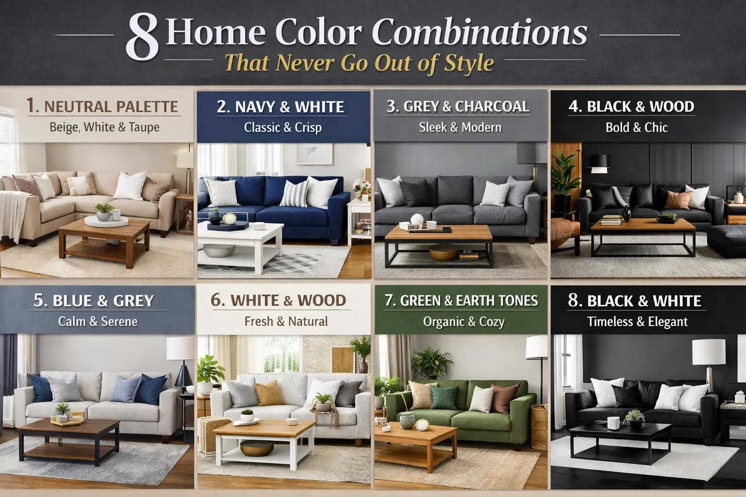
1. Neutral Palette (Beige, White & Taupe)
Why it’s timeless:
Neutral palettes have been used for centuries because they create balance, warmth, and flexibility. Beige and taupe add softness, while white keeps spaces fresh and bright.
Best for: Living rooms, bedrooms, open-plan homes
Design tips:
- Layer different shades to avoid flatness
- Add texture (linen, wool, wood grain, stone)
- Use darker neutrals in furniture, lighter ones on walls
Mood: Warm, elegant, calm
2. Navy Blue & White
Why it’s timeless:
This pairing offers contrast without feeling harsh. Navy is a classic color tied to tradition and sophistication, while white keeps it crisp.
Best for: Kitchens, bathrooms, coastal or modern homes
Design tips:
- Use navy for cabinets, sofas, or accent walls
- Balance with plenty of white to avoid heaviness
- Add brass or gold accents for warmth
Mood: Clean, classic, confident
3. Grey & Charcoal
Why it’s timeless:
Grey tones replaced beige as a modern neutral and have remained popular due to their versatility and understated elegance.
Best for: Modern living rooms, offices, apartments
Design tips:
- Mix light grey walls with charcoal furniture
- Use wood or warm lighting to prevent a cold feel
- Add one soft accent color (cream, blush, or green)
Mood: Sleek, contemporary, refined
4. Black & Natural Wood
Why it’s timeless:
The contrast between bold black and organic wood creates visual drama while still feeling grounded and natural.
Best for: Dining rooms, kitchens, modern homes
Design tips:
- Keep black matte to avoid glare
- Choose warm wood tones to soften the look
- Use black sparingly on large surfaces
Mood: Bold, luxurious, modern
5. Blue & Grey
Why it’s timeless:
Both colors are calming and neutral-adjacent, making them perfect for long-term comfort.
Best for: Bedrooms, family rooms
Design tips:
- Light grey walls with blue accents work best
- Choose soft blues (dusty, steel, slate)
- Layer with white or cream for brightness
Mood: Peaceful, balanced, soothing
6. White & Wood
Why it’s timeless:
Inspired by Scandinavian and minimalist design, this combination highlights simplicity, light, and nature.
Best for: Small homes, kitchens, modern interiors
Design tips:
- Use multiple wood finishes for depth
- Keep whites warm (off-white, ivory)
- Add plants to enhance the natural feel
Mood: Fresh, airy, natural
7. Green & Earth Tones
Why it’s timeless:
Green connects interiors to nature, while earth tones (brown, clay, tan) ground the space emotionally.
Best for: Living rooms, bedrooms, eco-inspired homes
Design tips:
- Use green as upholstery or feature walls
- Pair with warm woods and woven textures
- Avoid overly bright greens—stick to olive, sage, moss
Mood: Cozy, organic, restorative
8. Black & White
Why it’s timeless:
This is the most classic color contrast in design history—simple, powerful, and endlessly adaptable.
Best for: Any room, especially modern or classic homes
Design tips:
- Soften with textures (rugs, curtains, cushions)
- Add a third neutral (wood, grey, beige)
- Balance proportions—don’t overuse black
Mood: Elegant, dramatic, timeless
FREQUENTLY ASKED QUESTIONS (FAQs)
Q1: How do I choose the right timeless color combination for my home?
Start with:
- Room size (lighter colors for smaller rooms)
- Natural light availability
- Your furniture and flooring
Choose a palette that complements what you already own.
Q2: Can timeless colors still feel modern?
Yes. Timeless doesn’t mean boring. Update them with:
- Modern furniture shapes
- Contemporary lighting
- Minimalist styling
Q3: Are accent colors allowed in timeless palettes?
Absolutely. Use accent colors sparingly (10–15%) through:
- Cushions
- Art
- Decor pieces
This keeps the base timeless while allowing personality.
Q4: Which combination is best for resale value?
The safest options are:
- Neutral palette
- White & wood
- Grey & charcoal
These appeal to the widest range of buyers.
Q5: How often should I repaint if I use timeless colors?
Timeless palettes can last 5–10 years or more. You’ll likely update decor before repainting walls.
Q6: Can I mix multiple timeless palettes in one home?
Yes. Keep consistency by:
Repeating one base neutral throughout
Using transitions (hallways, rugs, wood tones)
Q7: What mistakes should I avoid?
Using only one shade (creates flatness)
Ignoring lighting conditions
Overusing dark colors in small rooms
Q8: Are timeless colors suitable for trends?
Yes. Trends change, but timeless colors provide the foundation. Trends can be layered on top through decor.